CSS Grid is awesome for creating all sorts of HTML layouts without having to rely on any external libraries. It supports 95.49% of major browsers according to caniuse (my condolences if you need to support IE).
Post migrated from Dev.to
Table of contents
- Update!
- Quick introduction
- Benchmarking | Creating columns and rows dynamically
- Getting an upgrade | Hardcoding common layout presets
- We need to go deeper | The thing I want you to see the most...Dynamically generating CSS grids
Update
Updated on 1 June
Based on the suggestions and comments to this post as well as this Github issue, get-grid@next is under development. A lot of important fixes have been made to the query format to accommodate for HTML tags, web components and IDs.
Please read the 2nd post of the series here to understand the new format.
These changes primarily affect the query format that is explained in the last section of this post.
Quick introduction
Creating layouts with CSS grid is pretty simple, but it's always good to write less repetitive code (I can hear a collective yes).
I started looking for ways in which I could generate CSS grids quickly.
I found a few generators online. This list on SitePoint covers many of them. I also found articles that gave you the code of some common layouts (like the Holy Grail), that you could copy-paste.
The drag-and-drop grid generators are great, but I was looking for something a little more ...dynamic.
What if you could create a CSS grid layout using the CLI? One that was very easy to read - so easy that you could probably use it to generate layouts dynamically and inject them at runtime?
The applications of this are pretty fun to think of.
- You can create a basic grid with 90% of the code pre-written in your command line itself
- Writing media queries will be a breeze
- (And if we are day-dreaming)... You could write a natural language processor that plugs into the underlying code. So someone could say, "Create a header that spans the full width. Now add a sidebar below that by making it a quarter width. Fill the rest of the row with the content..." and the words would be transpiled to a command that generates the code.
But I am getting a little too ahead of myself here.
Let's start off simple and understand how the CLI works. To create the CLI, I am using commander.js.
If you want to code-along, you can install the package from npm using
npm i -g get-grid
The most basic command you can try is:
get-grid
The tool copies the grid to your clipboard, but in case this doesn't work, just use the --output flag.
get-grid --output
And you can just do
get-grid --help
for some quick help
Level 1 - benchmarking
I started off simple:
The user should be able to specify the number of rows and columns they want, along with the parent container class.
So, to create a 2-column, 2-row layout, one would simply do:
get-grid -c2 -r2 --class grid-holder
And voila! The generator spits out this code:
<div class="grid-holder">
	<div>1</div>
	<div>2</div>
	<div>3</div>
	<div>4</div>
</div>
.grid-holder{
display: grid;
grid-template-columns: repeat(2, 1fr);
grid-template-rows: repeat(2, 1fr);
grid-gap: 1em;
}
Some properties are set by default as you will notice.
It's pretty basic, pretty rudimentary. It's still faster than typing it out by hand though, and it's faster than drag-and-drop too.
Time to turn it up a notch.
For the next level, I wanted to be able to type out the layout I wanted in the simplest way possible.
Level 2 - getting an upgrade
Creating common layouts quickly is very handy. I hard-coded a few common layouts and plugged them into a switch case. It's nothing innovative or great, but it generates the common layouts nonetheless.
So you can just do:
get-grid --template holy-grail
and you get this code:
<div class="grid-container">
        <header>
          Header
        </header>

        <aside class="sidebar-left">
          Left Sidebar
        </aside>

        <article>
          Article
        </article>

        <aside class="sidebar-right">
          Right Sidebar
        </aside>

        <footer>
          Footer
        </footer>
</div>
.grid-container {
        display: grid;
        grid-template-columns: 150px auto 150px;
        grid-template-rows: repeat(3, 100px);
        grid-gap: 1em;
      }

      header,
      aside,
      article,
      footer {
        background: #eaeaea;
        padding: 1em;
      }

      header, footer {
        grid-column: 1 / 4;
      }
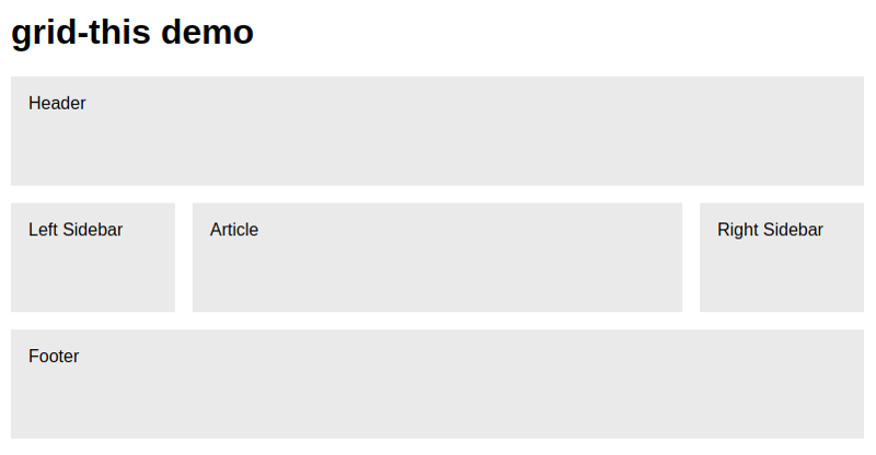
Which gives us this layout:

I have taken this layout directly from Codepen.
I haven't created many pre-defined layouts, but I am thinking of interesting ways in which one can create presets and name them for use later on.
As the screenshot suggests, the tool was supposed to be called "grid-this", but I like "get-grid" better.
This was still not the "dynamic-ness" that I was looking for. I wanted to be able to specify how the layout looked (via the CLI) and the code would be generated dynamically.
Level 3 - We need to go deeper
Update
The query format has been changed slightly to take care of IDs and semantic HTML as well as web components. You can check the 2nd post of this series to understand the changes here.
For this step, I had to devise a query notation of sorts; one that was concise; did not take a lot of time to think up, and could be taught quickly.
Here's what I came up with:
header/sidebar-content-content-content/footer
The "/" indicates a new row and the "-" indicates a new column. If an entire row is taken up by the same area, there is no need to specify it again.
So, what do we get out of this?
get-grid --query header/sidebar-content-content/footer
The code being spit out:
<div class="grid-container">
            <div class="header">header</div>
            <div class="sidebar">sidebar</div>
            <div class="content">content</div>
            <div class="footer">footer</div>
        </div>
.grid-container{
            display: grid;
            grid-template-rows: 1fr 1fr 1fr ;
            grid-template-columns: repeat(3, 1fr);
            grid-gap: 8px;
            }

         .header{
                padding: 1rem;
                grid-column: 1 / 4;
                grid-row: 1 / 1;
                border: 1px solid #444;
                background: #eee;
              }

          .sidebar{
                padding: 1rem;
                grid-column: 1 / 2;
                grid-row: 2 / 2;
                border: 1px solid #444;
                background: #eee;
                }

           .content{
                padding: 1rem;
                grid-column: 2 / 4;
                grid-row: 2 / 2;
                border: 1px solid #444;
                background: #eee;
             }

            .footer{
                padding: 1rem;
                grid-column: 1 / 4;
                grid-row: 3 / 3;
                border: 1px solid #444;
                background: #eee;
                }
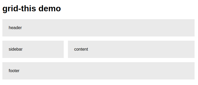
If you paste it to an HTML file, you get:

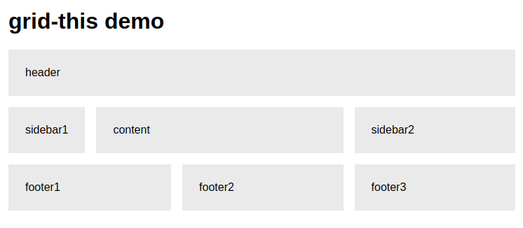
And this really is dynamically generating this layout. The code is parsing your query (twice) and generating the grid-column and grid-row properties. The query reads like a natural language, so creating simple layouts dynamically should be possible in theory.
So using this query:
get-grid --query
header/sidebar1-content-content-content-sidebar2/
footer1-footer1-footer2-footer2-footer3-footer3
We can get this:

It works, and it's simple, and it's dynamic! Yay!
But let's not get ahead of ourselves. This is a prototype, something I cooked up in a few hours (and I am still fixing bugs while writing this article). It has A LOT of things missing (some that I might not even be aware of).
I have a few ideas for how certain things could be improved. I will try to explain them in a Q&A format:
1) How to specify a custom height for a row?
For specifying height, the query could contain a ":" operator. Hypothetically speaking, it could be something like this:
header:60px/sidebar-content-content-content:auto/footer:200px
2) What if only a specific row or column repeats? What if a class spans across rows (rather than columns)?
To handle repeats, we could use a variation of "-" along with a "*" and "#" operator.
- We could do header/sidebar-content-3/footer to repeat the entire row thrice, increasing the row-height to 3fr (the "-3" is not detected as a class since CSS classes cannot start with a number).
- And header/sidebar-content*3/footer to repeat ONLY the "content" column thrice (keeping the row height 1fr)
- Or header/widgeta#2-content#3/widgetb/footer to keep the widgeta height to 2fr but increasing the content height to 3fr. "widgetb" will then fill up the 1fr space.
- We can also change the grid-auto-flow property by setting a flag.
3) What happens if an area is empty?
If we wanted to have a blank area where widgetb is, we could use a "." operator, by doing header/widgeta#2-content#3/./footer
4) What happens if you want to write classes with a "-"?
I tried using an operator other than "-" for separating the columns, but it drastically reduces readability and becomes much less intuitive in a reading. To get around this issue, we could use an escape character like "" to specify -'s that are not a part of the query itself.
I have not thought of all the possible cases and the above ideas are hypothetical. I will be working on these as the days pass. In the meanwhile, you can check out the GitHub repo. Do drop me a star if this tool helps you :)
Looking forward to comments, ideas, suggestions, and criticism!
